




Studio work
Rethinking what familiar banking journeys could be
Improving familiar digital journeys through a more human-centred approach

For a leading bank in the GCC, the opportunity wasn’t to rebuild its digital banking experience from the ground up. It was to rethink how existing journeys could work better for the people using them.
We explored opportunities to improve existing banking journeys through a more human-centred approach. By identifying potential enhancements to interactions, navigation, and visual design, we looked at how familiar journeys could become more intuitive and seamless for users.
Challenge
The challenge was to identify friction points across existing banking journeys and understand where the experience could be made more intuitive. Alongside improving navigation and interactions, there was an opportunity to strengthen visual hierarchy, refine interface elements, and bring greater consistency to the overall UI.
Industry
BankingServices
UI UX designUser Research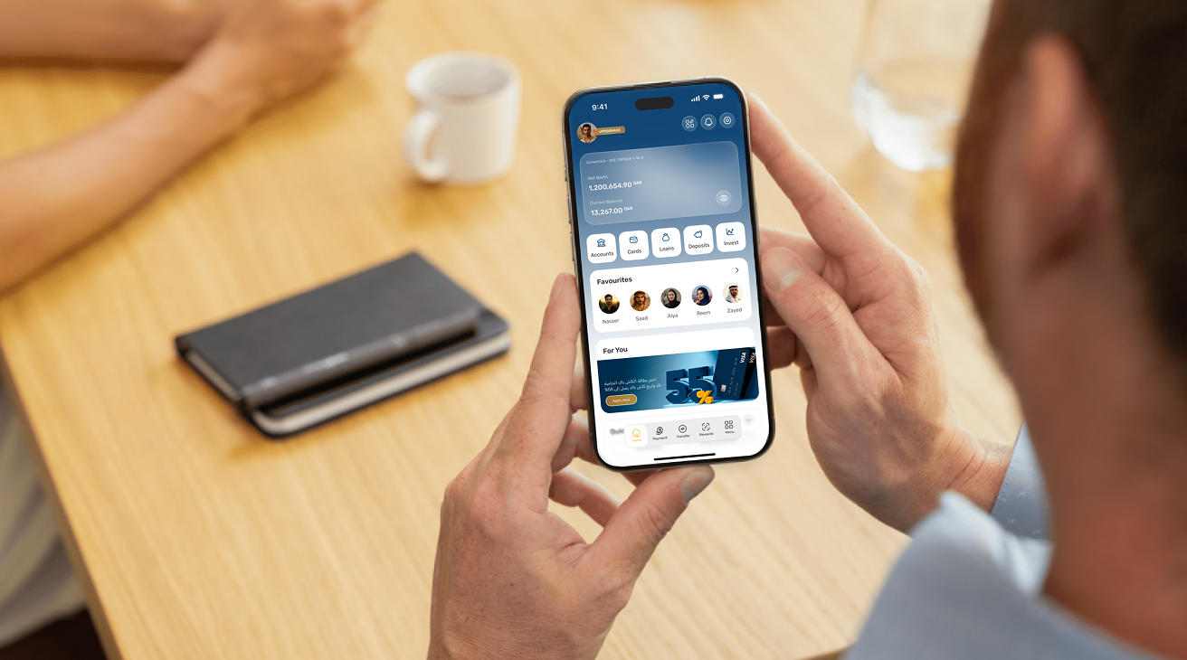
Our approach
We began by studying existing user interviews and speaking to real users to understand their needs, behaviours, and friction points. These insights helped us identify opportunities to simplify interactions and strengthen the overall journey.
From there, we rethought the user experience across familiar banking flows, focusing on clearer navigation, intuitive interactions, stronger information hierarchy, and consistent design patterns.
Complex interactions and visual inconsistencies across existing
banking journeys.
Simplified user flows and explored two refined visual directions.

Rethinking the digital banking experience
We explored the credit card application journey, focusing on how users could clearly understand where their application stood at every stage. A simple progress view brings together key milestones, from application submission and review to card activation, while clear status indicators and supporting information reduce uncertainty along the way.
We simplified interactions, strengthened navigation, and created clearer pathways through the journeys. At the interface level, stronger hierarchy, consistent patterns, refined iconography, and meaningful interaction cues helped make each screen easier to understand and use.
Exploring two visual directions
We explored two distinct visual directions to understand how the banking experience could evolve while maintaining clarity, consistency, and usability.
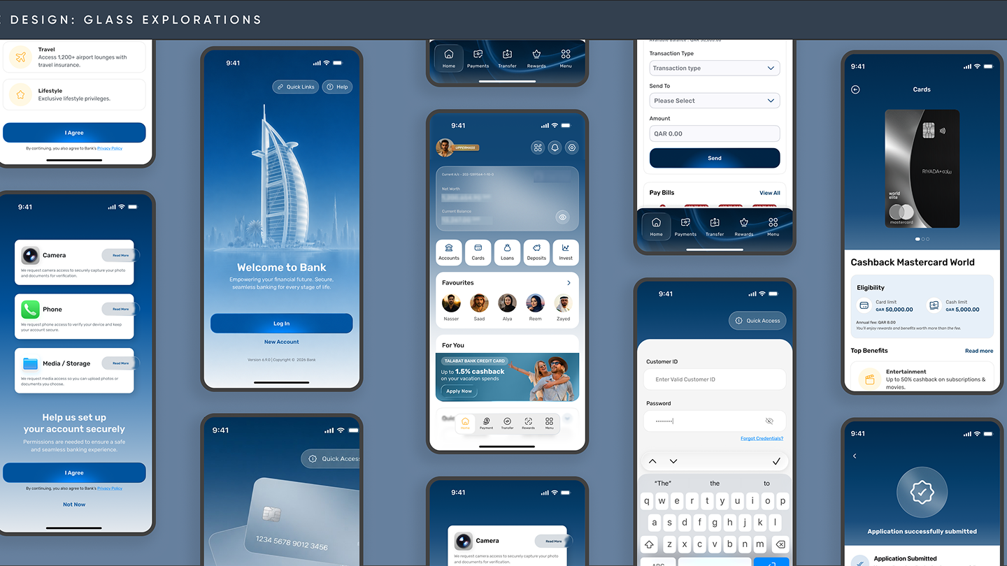
Glass Morphism
A more immersive direction that introduced depth, layering, and a premium visual language. The approach explored how a future-ready aesthetic could bring a greater sense of sophistication to everyday banking interactions.
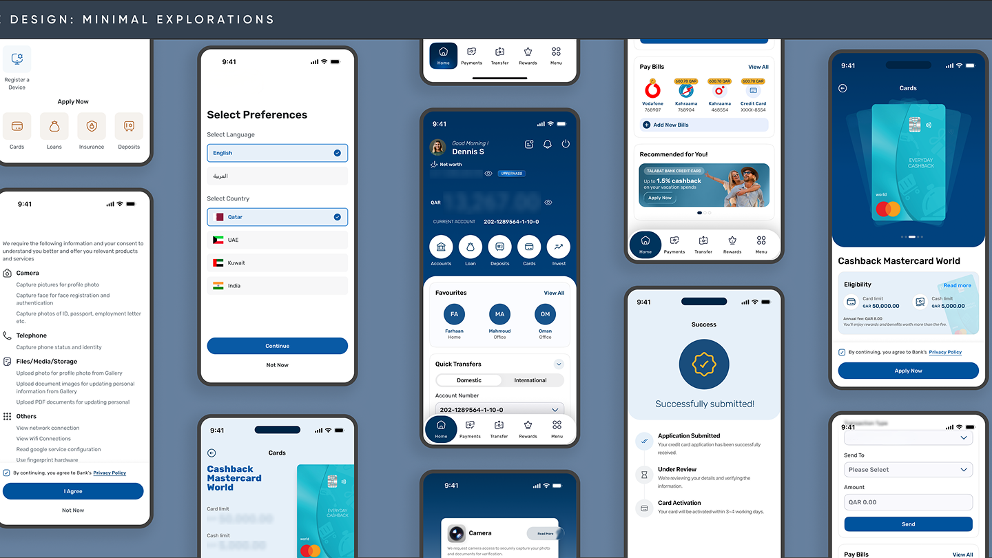
Flat Minimalism
A cleaner, more restrained direction focused on clarity, consistency, and scalability. By reducing visual complexity, this approach created a straightforward interface designed to work effectively across a wider range of banking journeys.
The result
Through user-led thinking, experience design, and visual exploration, we identified opportunities to make existing banking journeys simpler, clearer, and more intuitive. The result was a considered direction for elevating the digital experience through meaningful improvements to interactions, navigation, and UI.
When user experience leads the thinking, transformation doesn’t always mean starting again. Sometimes, it means making what already exists work better.