Looking Onwards to Iconography!
Lemon Yellow • Feb 22, 2023
Working in the UI UX industry as a Product Designer, I had the chance to work with many interns and freshers at my workplace. While working with them I came across one situation where people would often come up to me for iconography tips. I saw many freshers and interns struggle with getting icons right.
They were asked to create Apps, Presentations, Websites etc and somewhere they had to use icons. So, downloading icons from various sites and using them is not quite the right way to go about it. There are a few important things which we need to keep in mind while using icons in design.
So I thought of sharing some easy tips and learnings for beginners or designers which will help them get better at iconography.
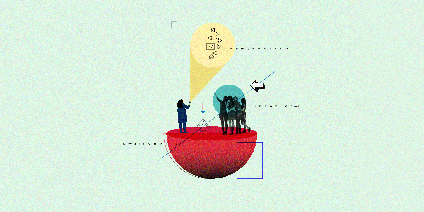
First let's understand what is iconography?
Iconography is the name given to the identification, description, and interpretation of images and icons. In art, imagery is such a powerful thing, and people will often interpret things in a subjective way. The use of images and symbols to portray a certain concept, ideal, or way of life is the essence of what iconography represents. That's why it's so important to look at iconography in as much artwork as possible.
What are the things to keep in mind while designing?
- Crack the ideation - Brainstorm and sketch out the icons as per the ideas that strike you. Sit with someone who knows more about iconography and sit with your own thoughts as well before you actually start off with the design of the icons. Get as much perspective as you can beforehand.
- Simple is awesome - Always take the minimal approach. Make the icons as meaningful and simple as possible. There is no use in over complicating an icon with extra and unnecessary detailing. Icons should always be symbolic as that communicates the exact meaning easily. So, reduce the noise, keep simplifying!
- Make your icon flexible - Here's a pro tip to make your icons absolutely pixelation-proof. Create a box around the icon and you proportionately stretch your icon horizontally or vertically as per your need; you can remove the outline color of the box later, so that the box always remains but not visible. This will help you every time you want to resize the icon proportionately. Quite a magical tip, isn't it!
- Keep uniformity throughout - While making a set of icons always make sure that they look like they are from the same family. By ‘from the same family' I mean, if your icon is outlined keep it consistent throughout and if it is filled apply the same for all the icons. Make sure if one icon has curvy edges the other one doesn't have sharp or crisp edges. Uniformity is a must while designing icons.
- Format matters big time - Vectors only, please! The format that you download the icon in is extremely important. I would like to share a few websites for free download of vector files and svg files.You can check out Flat Icons, Noun Project, Material Design Icon. It's ok to take the icons directly from these sites and using them but I would suggest tweaking them a bit as per need.
- Add colours carefully - Use colors while making icons only if needed. And if you are using colors make sure you are maintaining the right ratio. Try to design your icons as per the brand's colour scheme ratio. For instance, if the ratio of the two tones of a brand's shades is 70% to 30% maintain the similar ratio while using those colors in your icon.
- It helps to know geometry - It can benefit you if you have some knowhow of geometry. The basic knowledge about geometric shapes can enhance the way you design icons.
- Mix and merge - Sometimes one might be in a situation where they need to mix two icon elements to make one whole icon. Keep the simplicity approach in mind here as well and try to seamlessly merge the two icons so that you make one perfect icon.
Who would have thought that making an icon required so much effort, right! But it is an art that you need to master to finally be able to create icons that look good and communicate well. I hope the tips from my personal experience will help anyone out there struggling to get their icons right. Happy designing!
Sharing is caring