The Yellow Cycle
Understanding UI UX design with a simple metaphor
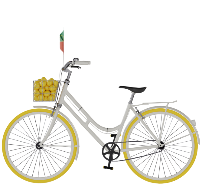

This is you, the user
This is simple to understand, right? Any product or service you use, makes you its user. It can be digital or physical, but when you think UI & UX design, think only digital.
Cycle is the user interface
The bell, seat, color of the cycle - everything you see and interact with is user interface design. You buy a cycle (or any product/service) because of 2 factors: one of which is how it looks. And this 'how it looks' is your user interface.
Cycling is user experience
The 2nd factor that makes you a loyal user of any product/service is 'how it feels'. The bell, seats, and pedals - features of the cycle (UI elements of any product) - determine the experience you get while cycling. The better designed the UI, the better experience you get, and vice versa.
Imagine your cycle is like this
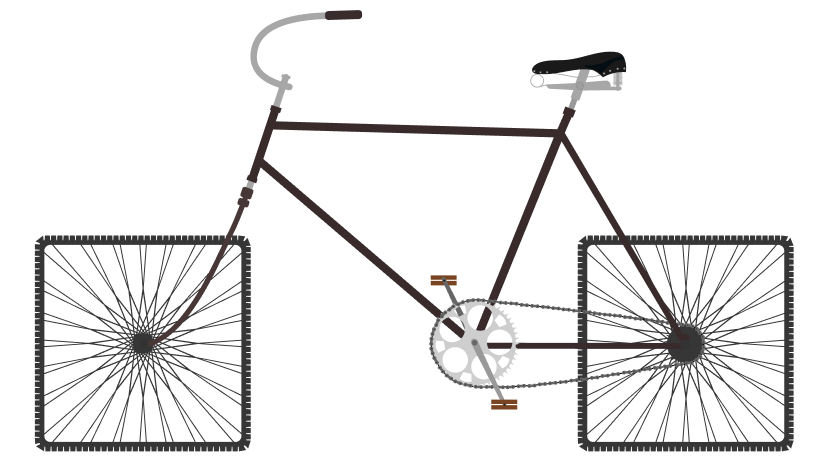
How will be your experience?
Not good, right? Get it?
UI UX design lies in everyday objects.
We see & experience it, every single moment.
We just don't know it.
What’s the Yellow Cycle? It’s our metaphor
If there’s one thing we have realized in the 5 years of designing UI/UX, it’s that people who don’t belong to the field of UI/UX, never truly understand what it is.
When we try to explain it, it either becomes over-simplified or over-complex. The beauty and curse of UI/UX design is just that - it’s extremely simple to understand, and extremely
effort-consuming to execute.
This miscommunication was a real pain point for us. Now, being a UI/UX design agency, our job is to identify such pain points and solve them. So we put on our UX hats, understood the issue, and
brainstormed many solutions. And found one that stuck - cycle.
Now, you might wonder how a cycle is the solution to make people easily understand UI/UX. Let us enlighten you. UI, short for user interface, is a very digital term. It means the visual design
of any product that has a digital screen. User experience (UX) on the other hand is as old as humankind. Because UX is all about the feelings and emotions any object/product invokes in the
person using it.
Hold on to this textbook definition of what UI/UX is. Now let’s move on to our metaphor, cycle.
We all know what a cycle is. Almost all of us know how to ride one. For some of us, it’s one of those important objects in our core memories of childhood or adulthood. Our UX man, Amit Bhambere,
is one of those people.
In fact, in the initial days of Lemon Yellow, he used to ride to the office, every day, on a cycle. Just a little trivia for you.
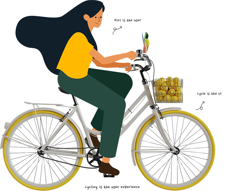
And now for the big reveal, here’s why we made cycle our metaphor. Cycle, the product/object, is your UI. You, riding the cycle, are the user. The experience you get when you are riding the
cycle is UX. Voila, UI/UX simplified!
Try to apply this logic to everything that you use, digital or physical, and you understand what UI/UX is.
For us, cycle fits.
What's yourmetaphor ?
Design & share it with us using
#MyYellowCycle
