From brrr to brrrilliant - A Venn diagram of experiences!
Meha Savla
01 Dec 2025
Chills, literal chills. The weather in Mumbai has been quite nice and cold lately. Coincidentally, the auto is covered in snowflakes too. Don’t believe me? See it for yourself!
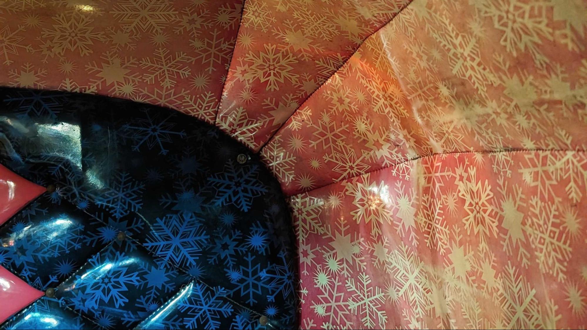
Winter is here!
Be it the scorching heat, unseasonal rain or humidity that sticks by all year round, the people of Mumbai bear it all for our one and only - winter. I enjoy winters precisely because of how short-lived the experience is. It’s basic human nature: the lesser you stand a chance of getting something, the more you want it. And the moment you get it, even if in the tiniest amount, you savor it. You love every tiny bit of it.
The same way you cherish an old tune that makes a comeback in your playlist or read a good copy at the end of a newsletter. These little interactions we have with the world around us end up turning our moods, if not days, around.
These little interactions are thoughtfully crafted for the user; a lot of them are even inspired by real-life incidents. For example, when you dine out in your favorite restaurant, you place your go-to order. And when you log in to a food delivery app and search for your favorite restaurant, you have your previous orders on top. Digital UX inspired by real UX, right there!
Good for our world of UI UX, we recognized the need and significance of interactions early on, and introduced micro-interactions. While the term “micro-interactions” was coined rather recently, in 2013 by Dan Suffer, its traces can be dated back to 1993 and beyond. One of the first micro-interactions was a text correction! Well, sources say it came from Charles Simonyi’s big brain, from the team at Microsoft. Believe it or not, it started from Word. Simonyi recognized Word already has an underutilized glossary, so why not use it to replace people’s teh with the? One code developed, million words corrected.

Thus began the journey of creating seamless experiences. To be very honest, up until now, I hadn’t recognized autocorrect as a micro-interaction - that’s the amount of seamless UX we’re talking!
Some micro-interactions are obviously visible, like the heart pop-up every time you like a post on Instagram. And some, not so visible, like the sound Twitter X makes when you refresh it. Irrespective of the visibility on the surface, one thing’s for sure - each micro-interaction has a specific intent, a purpose behind it.
Sometimes the intent is to:
- Prompt action:
Micro-interactions encourage users to interact, creating a wholesome experience for them to be a part of.
- Give feedback for action:
Or in simpler words, acknowledge. The visual feedback acts as a reward for the user’s action, assuring them that their action was accepted.
- Enhance the experience:
Micro-interactions are an actual source of delight, in all experiences. Without quite stealing the thunder of the main experience, they are only a cherry on the cake. Some extra delight sprinkled all over the user’s experience!
Be it with Slack mentioning you look good, every time you turn on the camera on a huddle, Mailchimp’s product descriptions when you hover on the list, or the copies on Zomato’s empty slates - so much thought. Micro-interactions have truly come to be the hero of designs. And star cameos in others, like at Fibe here!
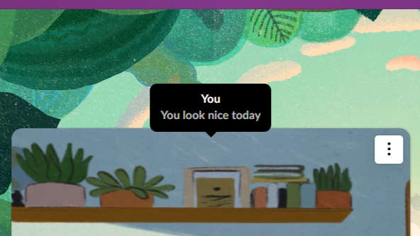
Slack’s way of complimenting me!
Where there’s some honest thought, there’s a good experience. As a user, I gush like a child at the sight of these micro-interactions, they give me the very user delight we often talk about.
These micro-interactions make a major difference. They make micro-entries in our lives and conversations too. You often hear friends say, “You have to see this cool new thing I saw on this app!” A user delight is best celebrated when it's shared, isn’t it? That is the real success metric here - the number of smiles or “Aha!” moments a micro-interaction generates.
But I wonder, do we only value micro-interactions because of how scarce the good ones are? Well, kudos to the delightful ones, but they surely should not be as rare. With the digitization of all things existing, it won’t be as rare now. Seeing a billboard with a striking copy is not an uncommon occurrence anymore. And, knowing we’re all on the right path, micro-interactions will soon be a necessity, not the sight of a black swan.
Dan Suffer states it correctly, “The difference between the products we love and those we simply tolerate are often the micro-interactions we have with them.”
Micro-interactions, thus, are the brownie points that make all the difference.
Micro-interactions have come a long way, for sure. And there’s still a long way to go. In all the forms they take, on all the interfaces there are, and in all the ways they are talked about - micro-interactions have aged well. And in the years to come, we hope to explore and set new benchmarks on how micro-interactions should be - a mix of beautiful and useful. Beauty backed with brains, if you may.


