





Journey Mapping: Customer journey maps that actually drive better products
Aarya Gole
26 Aug 2026
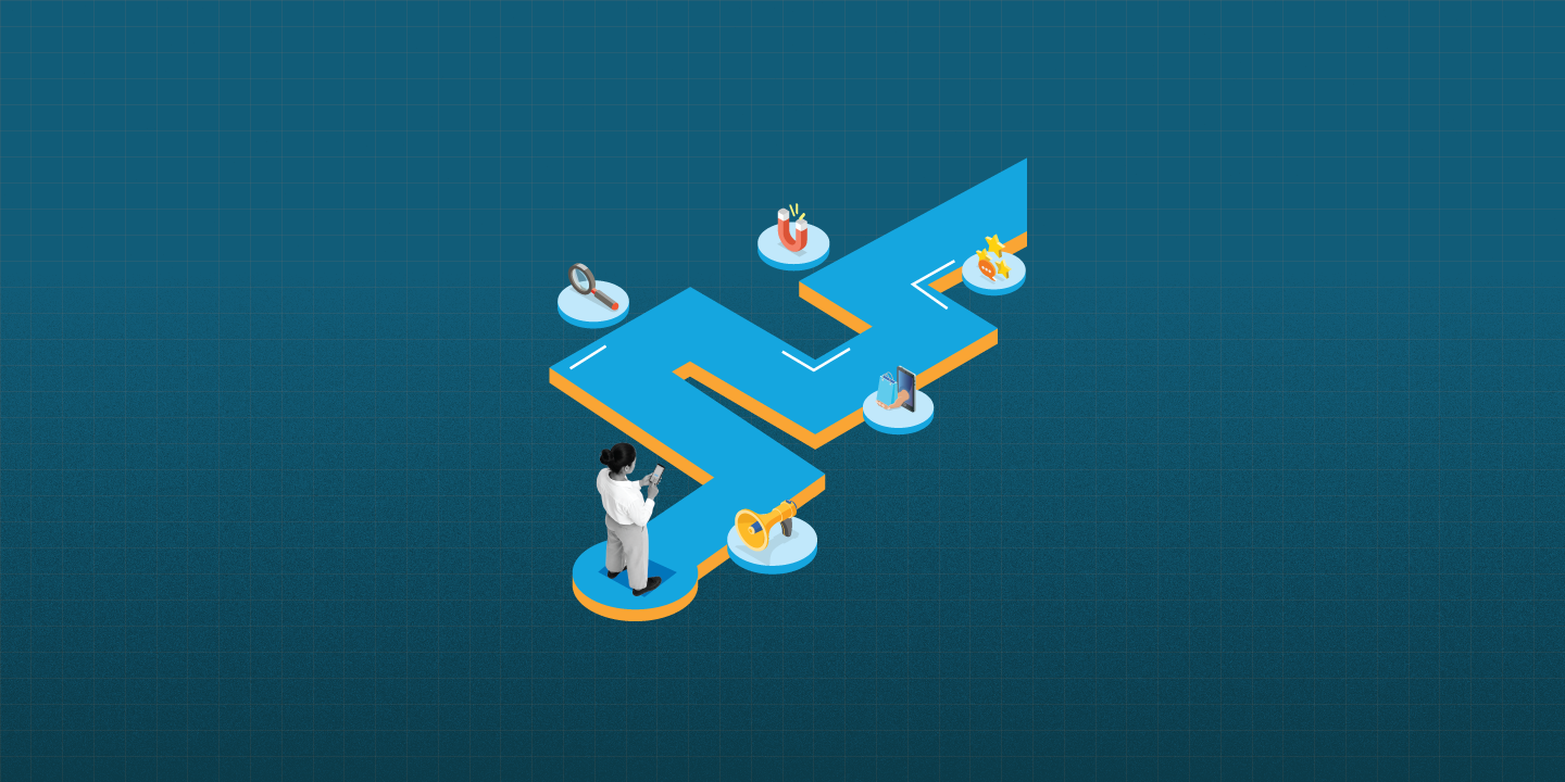
Most customer journey maps end up the same way. A team spends a full day in a workshop, sticky notes everywhere, someone exports it into a beautiful diagram, and then it sits in a shared drive forever. Nobody opens it again. No decision gets traced back to it. It becomes wall art with a fancy name.
That is not what a customer journey map is supposed to do. Done right, it should change how your team prioritizes features, fixes friction, and talks about the user. Done wrong, it is just a nicer way to say "we thought about the customer once."
Here is what separates a journey map that actually gets used from one that gets forgotten.
Why most customer journey mapping efforts fail
The biggest problem with customer journey mapping is that it is often built on assumptions instead of evidence. A team sits in a room and imagines what the customer feels at each stage. That is not mapping. That is guessing with a nice template.
A real customer journey map is built on actual behavior. That means talking to real users, watching how they interact with your product, and pulling data from support tickets, analytics, and interviews. This is where structured UX research makes the difference. Without it, you are mapping an imaginary customer, not the one who actually uses your product.
The second problem is ownership. A journey map without an owner is a journey map without a future. If no one is responsible for updating it, referencing it in sprint planning, or checking whether pain points have actually improved, it quietly becomes irrelevant within a quarter.
What a working customer journey map actually includes
A customer journey map that drives decisions is not just a pretty timeline. It includes a few non-negotiable elements.
Real touchpoints, not assumed ones. Every stage should reflect an actual interaction, whether it is a website visit, a support call, an app onboarding screen, or a checkout flow. If you are not sure what the real touchpoints are, that is usually a sign you need a proper UX audit before you map anything.
Emotional highs and lows tied to evidence. Anyone can guess that "checkout" is frustrating. A good map shows why, backed by drop-off data or direct user feedback, not internal opinion.
Clear pain points paired with opportunity areas. A map that only lists problems is half a tool. The other half is identifying where the product or content team can actually intervene.
A direct line to product and design decisions. This is the part most teams skip. Every pain point on the map should connect to a potential fix, whether that is a redesign, a new feature, or a content change.
Turning journey maps into a team habit, not a one-time workshop
The best way to keep a customer journey map alive is to treat it as a living document, not a deliverable. Revisit it every quarter. Bring it into sprint planning. Reference it when writing product copy or onboarding flows.
This is also where cross-functional collaboration matters. A journey map created in isolation by one team rarely survives contact with the rest of the organization. Running a structured UX workshop with stakeholders from product, design, and marketing ensures the map reflects shared understanding, not one department's assumptions.
Once the map is grounded in real research and has active ownership, it starts influencing things you would not expect. Onboarding copy gets sharper because writers understand where users feel lost. Feature prioritization gets easier because the team can see exactly where friction is costing conversions. Even UX writing improves, since the tone and clarity of microcopy can be matched to the emotional state customers are actually in at each stage.
Customer journey mapping is a tool, not a trophy
A customer journey map should never be the finish line. It is a working reference that should get messier, more annotated, and more useful over time, not framed and forgotten.
If your last journey mapping exercise ended in a polished PDF that nobody has opened since, that is not a failure of the format. It is a failure of process. The fix is not a better looking diagram. It is grounding the map in real research, giving it a clear owner, and building the habit of coming back to it when decisions actually need to be made.
Done this way, customer journey mapping stops being a workshop activity and starts being what it was always meant to be: a tool that actually drives better products.
FAQs
What is a customer journey map?
A customer journey map is a visual representation of the steps a customer takes while interacting with a product or service, including their actions, emotions, and pain points at each stage.
Why do most customer journey maps fail to create impact?
Most journey maps fail because they are built on internal assumptions rather than real user research, and because no one owns the map or connects it to actual product decisions after the workshop ends.
How often should a customer journey map be updated?
A customer journey map should be revisited at least once a quarter, or whenever there is a major product change, so it reflects current user behavior rather than outdated assumptions.
What data should go into a customer journey map?
A reliable journey map should be based on real inputs such as user interviews, support tickets, analytics, and behavioral data, not just internal opinions about how customers feel.
Who should own a customer journey map within a team?
Ownership typically sits with a product or UX lead, but the most effective customer journey maps are built and maintained collaboratively across product, design, and marketing teams.
What is the difference between a customer journey map and a service blueprint?
A customer journey map focuses on the customer's experience and emotions, while a service blueprint adds the internal processes, systems, and teams working behind the scenes to deliver that experience.
Can customer journey mapping improve UX writing and onboarding copy?
Yes. When a journey map clearly shows where users feel confused or frustrated, it becomes much easier to write an onboarding copy and microcopy that matches the user's actual emotional state at that stage.
Sharing is caring