Color psychology 101: Creating memorable experiences through color
Akshata Naik
01 Dec 2025
Learn how understanding color psychology can enhance user engagement and trust. Discover how tailoring color choices to your audience’s demographics and cultural preferences can create a memorable and impactful experience.
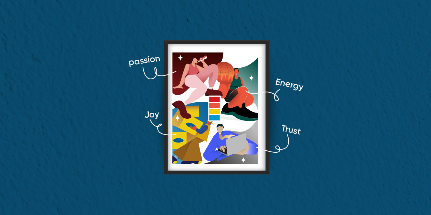
Every day before starting work, my friends and I have this little ritual where we fill out something we call a moodboard. We've assigned 8-10 colors to different moods, and we color in the sheet based on how we’re feeling that day. It’s a simple way to let everyone know where we stand emotionally, which helps us understand how to approach and interact with each other. It’s fascinating how something as complex as a “feeling” can be expressed so clearly through just a shade. This is where the magic of color psychology comes into play.
Color psychology explores how colors influence human behavior and emotions. Each color, hue, and tone evokes unique associations and reactions. Whether in virtual spaces or real life, understanding this connection is key to designing meaningful experiences. Let’s dive into how color psychology plays such a vital role in shaping these interactions.
Emotional resonance
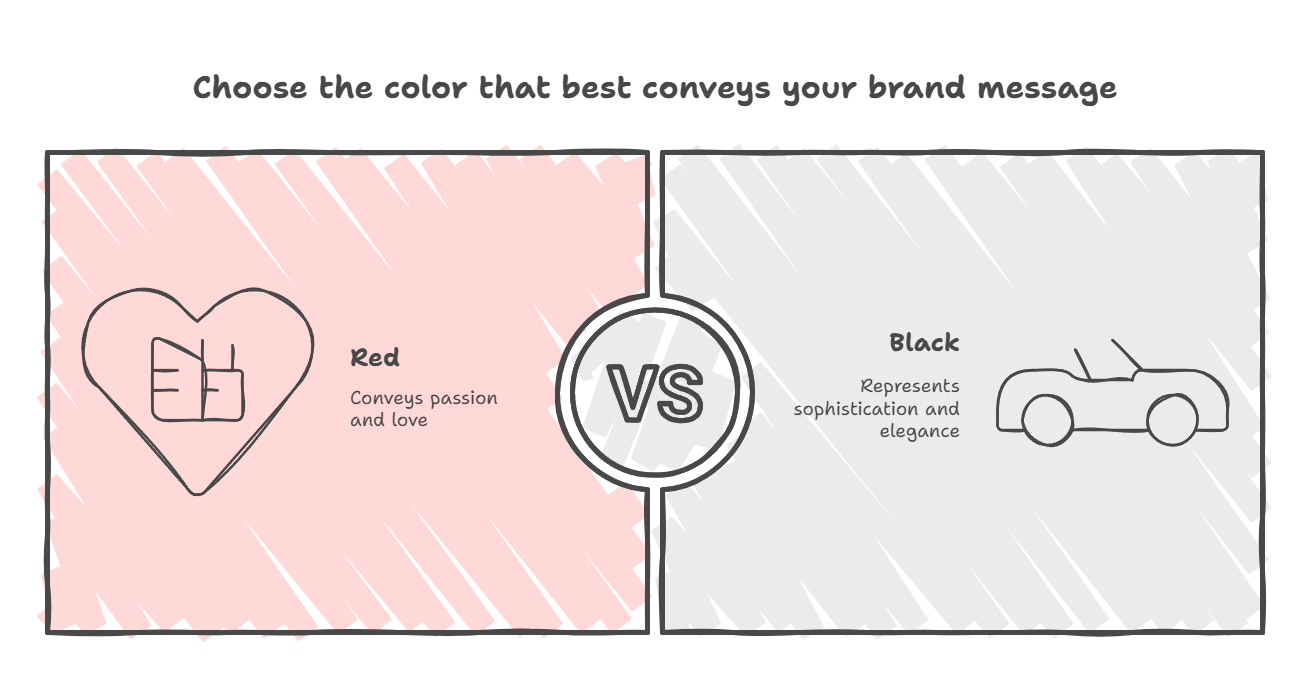
Have you ever wondered why red and white balloons are the go-to choice for Valentine’s Day or why black seems to be the most popular color for a brand-new car? It’s no coincidence. It’s because colors have a way of triggering specific emotions and sending messages without words. Every color has its own meaning, and it’s important to pick the right ones to connect with your audience.
This is why it’s crucial to understand the emotions and messages you want to communicate to your target audience. Colors aren’t just visual elements; they’re a language of their own, capable of connecting on a deeply emotional level. By choosing the right colors, you can effectively convey your brand's essence, establish familiarity, and build trust with your audience.
For instance, red is often associated with passion and love, making it perfect for Valentine’s Day celebrations. On the other hand, black displays sophistication and elegance, which is why it’s a classic choice for vehicles and luxury items. The right colors can make people feel like you understand them, which helps build stronger relationships and lasting impressions.
Cultural relevance
When designing experiences, it’s essential to consider cultural differences, especially when catering to a global audience. Colors play a significant role in cultural contexts, carrying meanings and emotions that vary widely across regions. For instance, some colors symbolize joy, celebration, and auspiciousness, while others might represent misfortune or bad omens.
Understanding these cultural nuances is crucial because the colors you choose can heavily influence how users perceive your brand. A seemingly innocent choice in one culture could unintentionally offend or alienate another. For example, while white represents purity and peace in many Western cultures, it’s often associated with mourning in parts of Asia. Similarly, red might evoke passion and energy globally, but in certain cultures, it also signifies luck and prosperity, especially during festivals.
By taking the time to research and identify these elements, you not only avoid potential cultural missteps but also build a stronger connection with your audience. Thoughtful color choices show that your brand respects and values the diversity of its users, which can have a significant positive impact on brand perception and loyalty in a global marketplace.
Demographic preferences
Colors have a unique way of resonating with individuals, but their impact often varies across age groups, gender, and socio-economic backgrounds. This disparity can be observed even in our own homes, where the color choices that captivate us might hold little appeal for our parents. For instance, younger generations tend to lean towards subtle and minimalist color schemes, favoring calm, understated tones that align with modern aesthetics. In contrast, older generations often gravitate toward brighter, more vibrant hues that evoke energy and familiarity.
As times evolve, so do preferences and perceptions of color. What once symbolized luxury or simplicity may now take on a new meaning for different demographics. This shift highlights the growing importance of understanding visual presence in today’s world. Colors do more than just enhance aesthetics, they serve as powerful tools for creating lasting impressions. When thoughtfully chosen, they help bridge the gap between a brand and its preferred audience, fostering connections and building trust.
By recognizing and adapting to these preferences, whether for a product, service, or personal expression, you can ensure your visual identity resonates deeply with your target users, leaving a meaningful and memorable impact.
Industry expectations
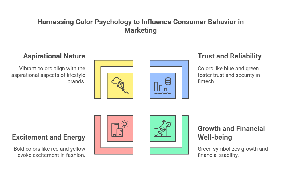
Color psychology plays a significant role in crafting an industry-specific approach, as colors evoke emotions and perceptions that can significantly influence consumer behavior. In industries like fintech, where trust and reliability are extremely crucial factors, using colors like blue and green can develop confidence and a sense of security. Blue, often associated with stability, fosters trust, while green symbolizes growth and financial well-being. Similarly, the fashion and lifestyle sector benefits from bold, vibrant colors like red and yellow, which evoke excitement, energy, and creativity, aligning with the aspirational nature of the industry.
By strategically leveraging color psychology, businesses can create a visual identity that resonates with their target audience, enhances user experience, and drives brand recall, ensuring they stand out in their specific market.
Personalization
Understanding and implementing color psychology simplifies crafting personalized experiences in both digital and physical spaces. For example, warm tones like reds and oranges in restaurant interiors can stimulate appetite and create a sense of coziness, while cooler hues like blues and greens in healthcare settings promote calmness and trust.
When paired with customization, the potential for personalized experiences grows exponentially. In retail, offering customers the ability to choose packaging colors or customize products based on their favorite palettes can make the experience more memorable. Similarly, events or hospitality spaces designed with adaptable lighting and decor can cater to the preferences of diverse audiences, enhancing comfort and engagement.
By combining the insights of color psychology with opportunities for personalization, experiences become more immersive and impactful, whether it's a vibrant wedding venue, a tailored fashion line, or a calming spa environment. This holistic approach ensures that every interaction feels uniquely tailored, leaving lasting impressions.
Color is more than just a visual element; it’s a language that speaks to emotions, values, and perceptions. By leveraging the principles of color psychology, you can craft experiences that are not only visually appealing but also deeply impactful. Thoughtful color choices tailored to your audience ensure your message resonates, helping you build trust, enhance engagement, and leave a lasting impression. Whether you’re designing for a brand, a product, or personal expression, understanding how colors influence people will always be a cornerstone of effective communication.
We hope this blog offered some great insights into color psychology and how you can use it for enhancing experiences. Ready to elevate your designs and enhance your digital presence? At Lemon Yellow, we specialize in crafting delightful user experiences that leave a lasting impact. Let’s create something amazing together, contact us today!
Sharing is caring