Using Real Copy vs Lorem Ipsum in Designs
Nikita Sarmah
04 Sep 2024

Imagine a world with dummy names. You go to a grocery store named ABC Store where there are aisles full of cereal from the XYZ Company. You go up to the billing counter and there is a person wearing a name tag that says GJJHJH. It all feels so odd right? Then why are we okay with using dummy text, popularly known as Lorem Ipsum in the design circles, while designing digital products?
Some of you may ask, what is Lorem Ipsum? It sure sounds like a quirky chemical! Lorem Ipsum is a placeholder or dummy text that has been around since the 15th century and has been used by designers as a placeholder for content since the 1960s. While it started out to indicate where a certain copy will appear in the design of a product, it comes with its own shortfalls.
In today's world, dummy text offers little help while designing a website or application. While on one hand it does help the designer to indicate the areas where text will be placed throughout the design, it leaves more room for ambiguity, the repetitiveness of the text fails to make an impact, and the dummy text falls weak in communicating the message or idea behind the design concept on the other.
Working in a UI UX design agency for the past 3 years, I have had the opportunity to observe some of the best in the design field and learn how UX writing has slowly evolved and enriched the way digital products are designed. We as an agency have incorporated good writing as an important thread in weaving great UX. We are in fact at a point where using dummy text almost feels sacrilegious. So designers, here are a few reasons why replacing all the lorem ipsum with real copy is going to win you all the praise and accolades.
- It helps you sell your idea better
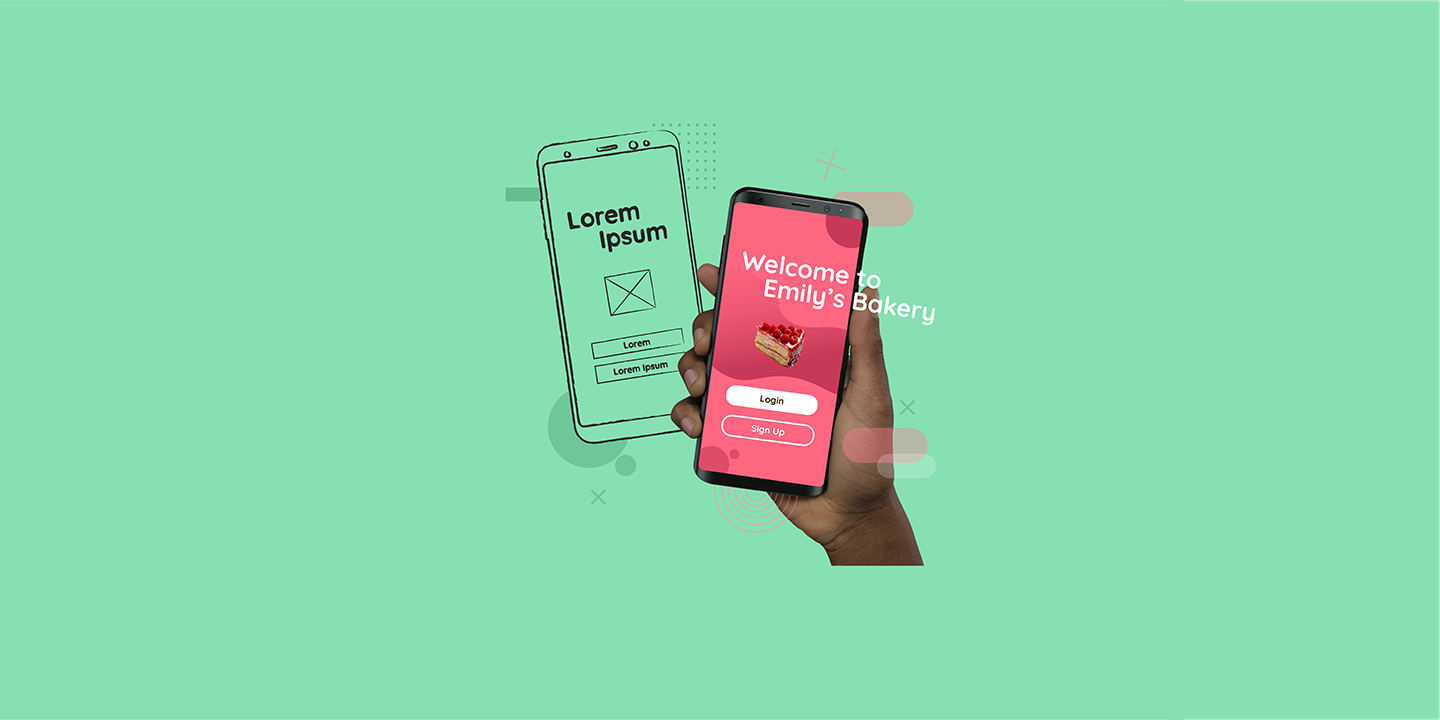
You can try this to believe it. Design a homepage of a website using nothing else but dummy text and beside it make a replica using original text that talks about the brand you are designing for. The proof is in the design! You can convey your idea of the homepage with so much more clarity with the OG text, right? Your mentors and clients are definitely going to get what you are saying only if you use the text that was always meant to be in the design.
- It helps you gauge the real estate
The real estate or area you have got to design can be utilised to the fullest only if you place the actual text that will finally end up occupying all that space. If you use a placeholder text at the initial stages and later go to replace it with the final content, there is a high chance that you will end up misjudging the layout which will inevitably disrupt your alignment and spacing. So why not use the real text to get a sense of the real estate that it will end up using right at the very start?
- It helps you get the right feedback
Only when you use relevant text the product stakeholders will be able to truly express how they feel about the content. The emotion and vibe that the text gives out can be received at that very point itself and there might be feedback that you may never have gotten had you used some random dummy text. Agreed?
- Never leave out content at planning
While you are at the planning stage, one usually researches about the product, references for inspirations, looks up the competition, plans a design sprint and so on. It is essential to include content creation as a part of this stage as well so that there is no need to run helter-skelter for copy when the design is finally coming to life.
- Get the stakeholders involved
While interacting with the product stakeholders, one can make sure that all questions pertaining to the content are asked and answered. Try to get all the content, refined or drafts, from the client at the initial stage itself. For instance, if there are any data points like numbers, percentages, values, and important calls to actions, it is always a good practice to get those in advance. This can save you a lot of hassle later and help create a perfect design.
- Take a look at the competition
This may sound odd but is definitely an effective tip. If you are working on a project where there is absolutely no content available at the initial stage, when the client is yet to create something and share with you, you can resort to the competition for help. A website or app from the similar domain can help you get some inspiration in terms of the way they have used the content. Believe me, this hack is going to save your life! ;)
Hope this was helpful and I get a feeling that the ones who were in team Lorem Ipsum have started to lean towards team Real Copy. In the end, all we want to do is create beautiful, realistic and relatable designs that not only impress the clients but ultimately help the end user! So, gear up and keep designing digital happiness :)


