PiscesER1 Marine
.png)
Redesigning marine voyage with delightful interactions
A collaboration for designing digital happiness that gave the users a smooth sailing experience.

PiscesER1 Marine made their mark to prominence for providing excellent services in the Marine Vessel IT industry. They provide IT Solutions to marine vessels sailing across different routes
along with companies that work with large number of fleets.
Keeping design thinking at the core, we curated a user experience that helped PiscesER1 Marine garner more leads and brought digital happiness to the users from coast to coast.
Challenge
We needed to build a website that portrayed marine IT to the global users in a simplistic manner. The brief was to keep the branding intact, generate more business as well as show the industry excellence of PiscesER1 Marine through their work portfolio.
Industry
Marine ITServices
UI UX designCreative Quotient
Design lead UI UX designers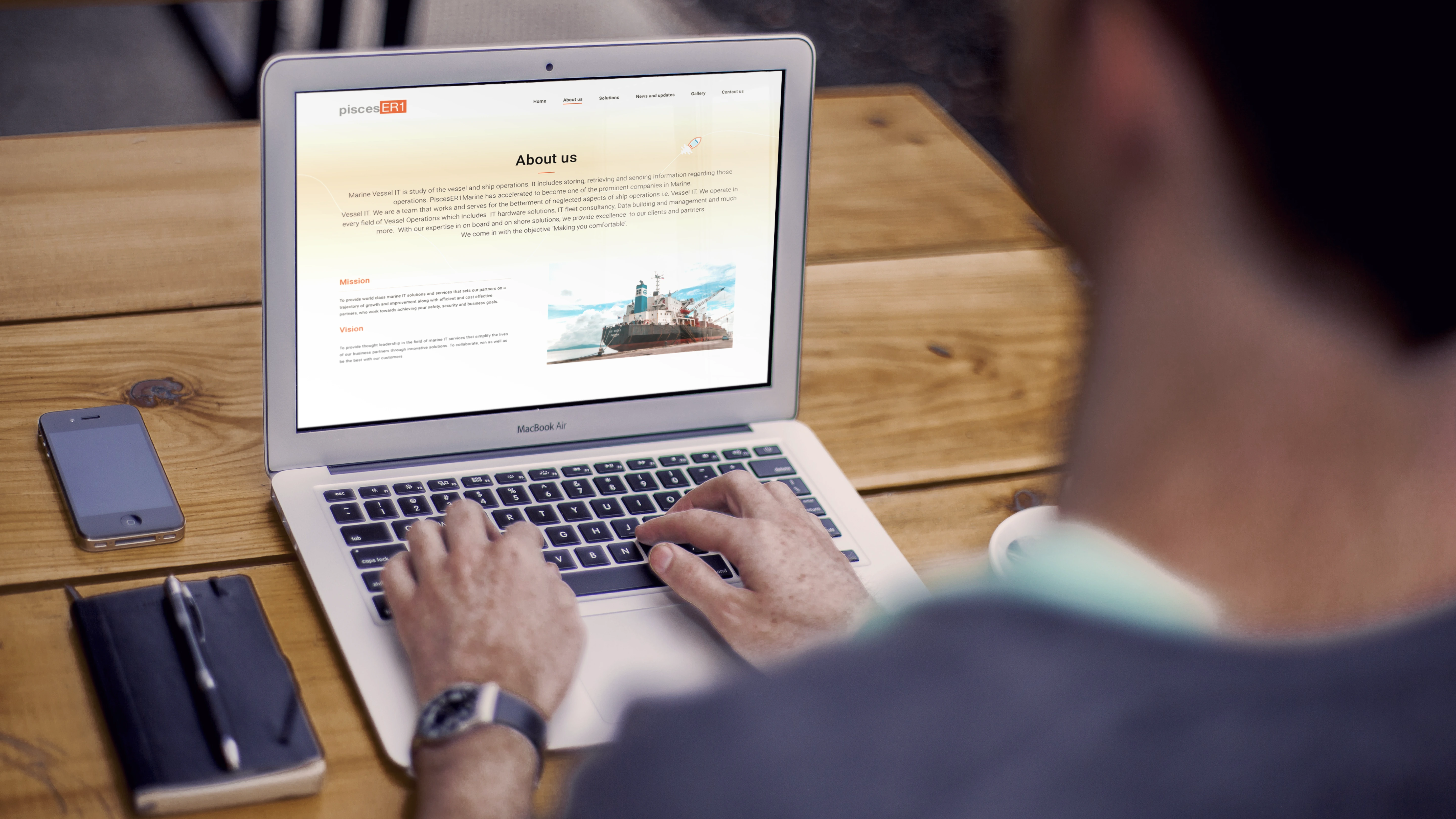
Our approach
Lemon Yellow and PiscesER1 Marine's collaboration set sail three years ago where we started off with a website redesign. Our approach was to create intuitive designs with user-friendly
features that captured what PiscesER1 Marine stands for as a brand.
The main aim was to design a website that would assist in generating more leads for the PiscesER1 Marine while also giving a pleasant experience to any user that visited the website.
The Lemonade Process
Adding a refreshing zest to the designs
- Research
- Requirement gathering
- Our understanding
- Competitive analysis
- Plan
- Stakeholders interview
- User interview
- Information architecture
- Explore
- Design workshop
- Wireframes
- Moodboarding
- Create
- UI design
- Design system
- Delight
- Prototyping
- Interactions
- Analyze
- User testing
- Implementation
Understanding the users

The primary users of PiscesER1 Marine are marine fleet owners who own cargo ships. These users rely on PiscesER1 Marine to manage their vessel operations efficiently and effectively.

The IT operations PiscesER1 conducts have to be approved through the decision makers of the company. It's important to reach every key decision makers of the marine world for brand awareness.
Lack of inbound leads. Inconsistent brand guidelines. Lack of structure.
Focus on lead generation. Visually appealing look & feel. Shorter user journey.

Making lead generation engaging
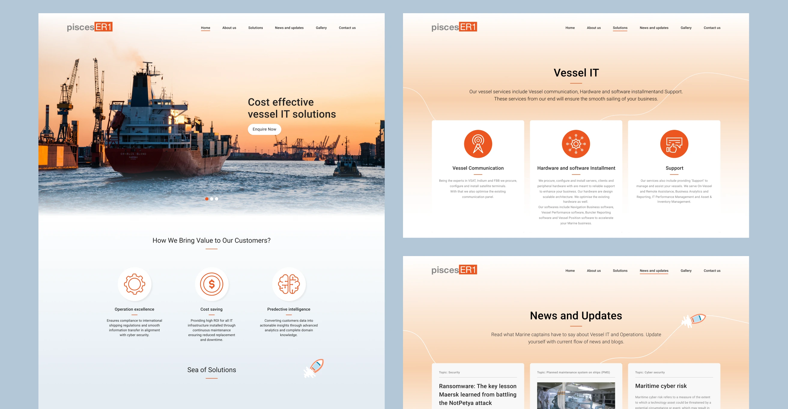
What was earlier a longer journey to get in touch with the company was now made engaging as well as shorter. We wanted the user to have convenience at their fingertips.
This translated to us bringing the Enquire Now button to the first page of the website. We also brought the aesthetics to work portfolio to make it look interesting.
Adding the delight with visual design
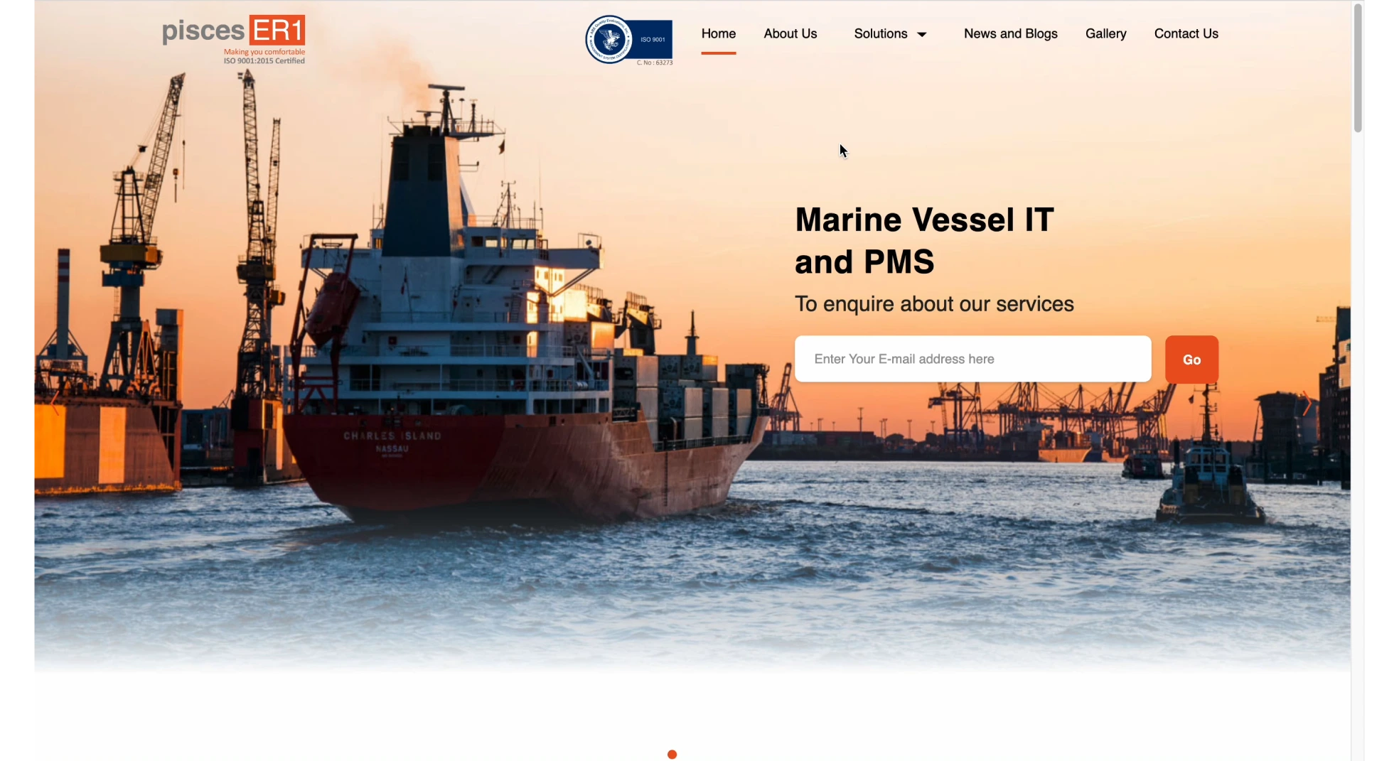
Our designs were inspired by the oceans and vessels. Keeping the theme at core, we created interactions and iconography that were simple, creative and business oriented while maintaining the essence of PiscesER1 Marine.
Responsive and seamless designs
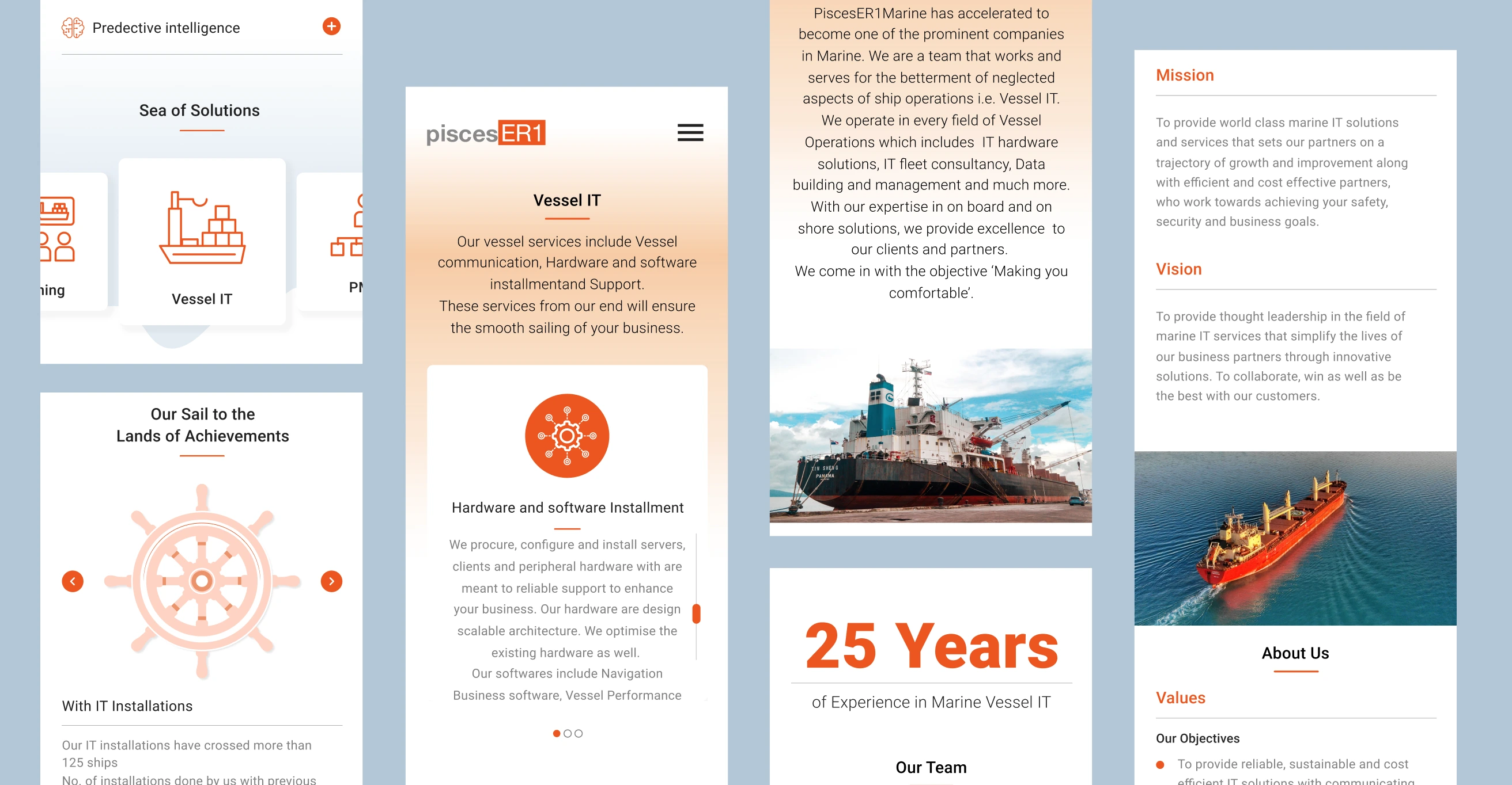
We made a visual language which was responsive and engaging for the users who visit the website. The main aim was to have a design system which was consistent throughout the website while
keeping branding in mind.
We used interactions and imagery that would be in alignment with the brand. We designed and followed a theme. Even the slightest details contributed to a tidal wave of delight!
The result
Our happy ending set sail towards generating more leads for PiscesER1 Marine through designs that brought digital happiness!🎉
We also
developed this design
and marketed PiscesER1
Our development and marketing
services, rounded off the
experience design.
