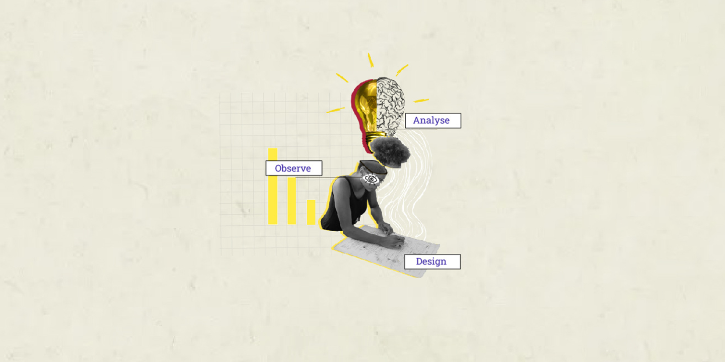
How to design for the reluctant user?
Amit Bhambere
24 Nov 2025

Designer maverick Dieter Rams once said, “You cannot understand good design if you do not understand people; design is made for people.” This design philosophy is the driving force behind creating designs that appeal to different types of customers.
The toughest eggs in the basket however, are the reluctant users who just won't be impressed. “Not interested” is a common reaction we direct towards telemarketers before they even finish their sentence. Probably they would seem to make more sense if we could hang on a little longer and heard what they had to say. As a UX designer, we also encounter the “Not interested” reaction. However, we have to consider this type of audience too while working on a particular project and in my opinion, if you can convince them to use your product, you have nailed it!
Who is the reluctant user?
A reluctant user is a person who given a choice, will never use your product no matter how thoughtfully you have designed the layout or how beautiful it looks. So we as designers need to make their experience as smooth as possible. It won't be wrong to say, that we literally need to spoon feed them with the UX design.
How do we solve this?
- Let them discover what they are looking for - eliminate unnecessary elements like longer on boarding for a first-time user, unwanted interactions that prolong the experience, unnecessary steps in a sign up flow and so on.
- Use a simple, easy-to-understand language. Avoid jargon and keep the communication simple and to the point. This will take the load of the user who is already not thrilled about reading words he/she does not understand.
- As Don Norman says in his definition of user-centric design, along with discovery, provide a feedback every time the user takes an action. Set the expectations right by showing the number of steps, completed steps in a process journeys.
- Provide instant gratification at every completed step. You must make him/her feel happy after accomplishing a task. Little things like well done; that's great, you are almost done, etc. always gives a mental boost to the user.
- In every possible way, make the interface light-weight. Make the shortcuts available for users at every level. Use auto-completes which will save their time and make the user sail through your interface easily.
At the end of it, you need to make them feel better. The “not interested” guys can only be interested, if you make them stay longer on your product. These are few things that can help design a comprehensible product for the reluctant user. My design process is based on discovery. Once you've understood the reluctant user, there's no stopping you.


