


ffreedom app
Designing a global brand identity for a self-learning application
Collaborated with Indian Money to design a new logo for their financial & educational online platform called ffreedom.
ffreedom is a platform by Indian Money aimed at providing access to knowledge and opportunities to people. The
application was designed to provide financial freedom to their users in semi-urban and rural locations. These
users don't come from educationally strong backgrounds but wish to learn through online courses provided by
ffreedom.
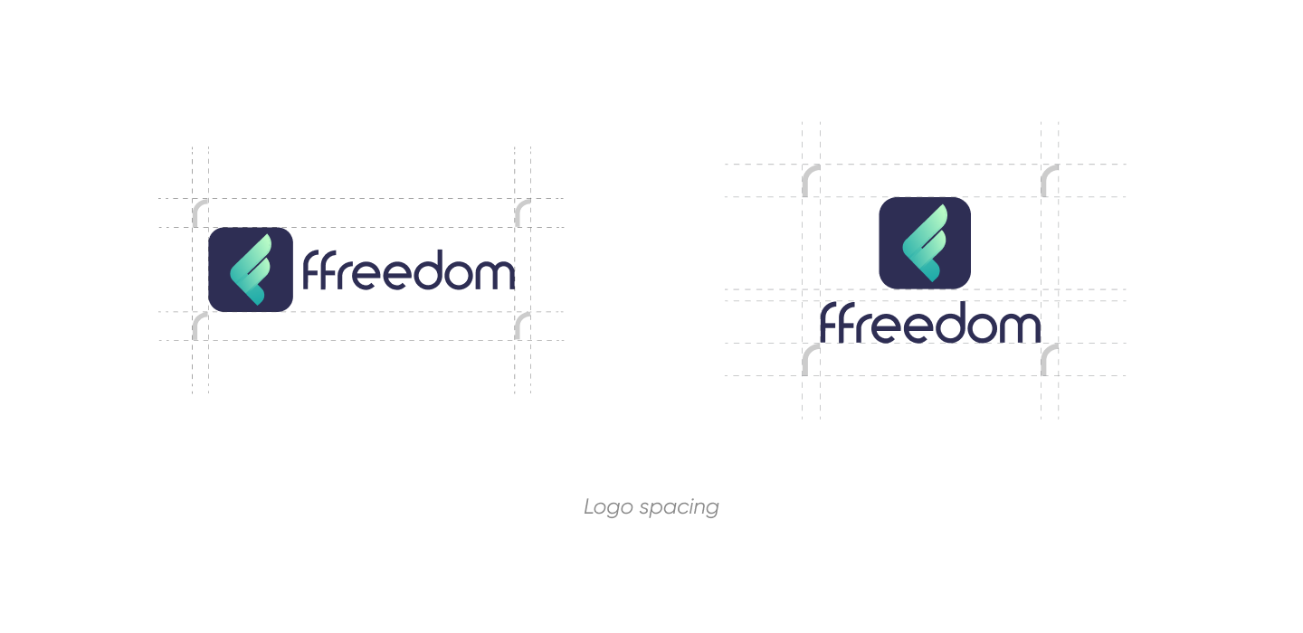
Keeping design thinking at the core, we created a new brand identity for freedom through a new logo. This new
identity was an extension of what ffreedom's core beliefs and values with our touch of creativity.
Challenge
We wanted to represent the ffreedom through their new identity. We had to ensure that this new logo was scalable, global and left its mark on everyone who comes across it. The challenge was to give the logo a recognition of its own which was separate from Indian Money.
Industry
EdTechServices
BrandingCreative Quotient
Graphic designer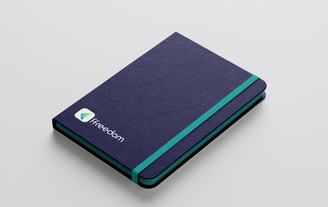
Our approach
ffreedom and Lemon Yellow's collaboration resulted in a logo that represented freshness and growth, which is
exactly what lies at the core of ffreedom as a brand.
Our approach was to go the simplistic and modern way. We wanted to maintain the familiarity of the logo with
their users and add a touch of renovation to it. The need to redesign the current brand name and give it a new
look fit for future global expansion was our focal point throughout the journey.
The Lemonade Process
A fresh squeeze of creativity that we added
- Research
- Requirement gathering
- Our understanding
- Competitive analysis
- Plan
- Stakeholders interview
- User interview
- Information architecture
- Explore
- Design workshop
- Wireframes
- Moodboarding
- Create
- UI design
- Design system
- Delight
- Prototyping
- Interactions
- Analyze
- User testing
- Implementation
Understanding the users

These users are the ones who are new to the world of finance and looking to gain more knowledge about it. They wish to learn about it through online courses but don't necessarily have the financial strength to do so.

This category of users are the budding entrepreneurs and future business owners who are looking to get genuine and trust-worthy financial education as well as financial advice, all on one platform.

These users belong to the working class who don't have a strong educational background. They wish to live life on their own terms, make informed decisions and enjoy their financial freedom with help from the platform.
Translating financial ffreedom for users across the globe
ffreedom aims to give every user an equal opportunity to learn through their platform. They focus on making their resources accessible to everyone by sharing their content in six languages.

Bringing meaning to the real world
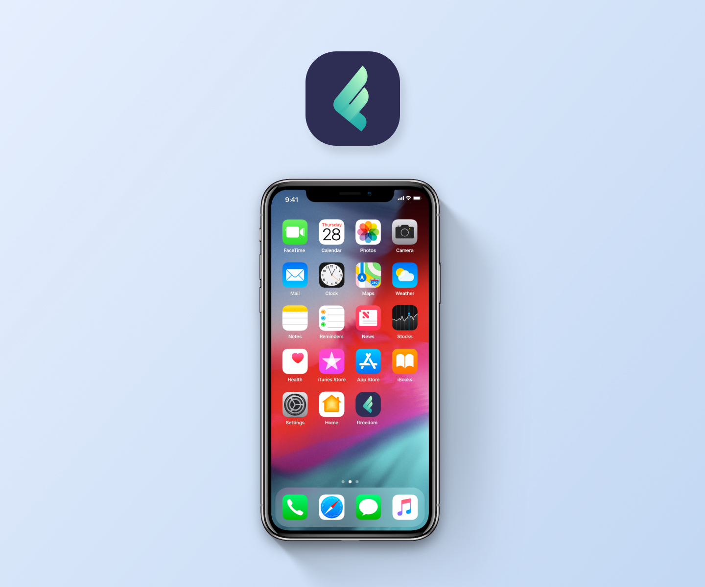
To kickstart the design process, we got to thinking what comes to mind when you hear the word freedom and played around with related visual elements. A couple of crumpled up paper balls and brainstorming sessions later, we had a sketch of what is now their logo!

Expressing emotions through colors
Colors speak louder than words, always. That's exactly why we used colour psychology for the new logo. We chose shades of green because they tie closely to money and generosity. The lighter shades in the design indicate freshness, anticipation & growth.


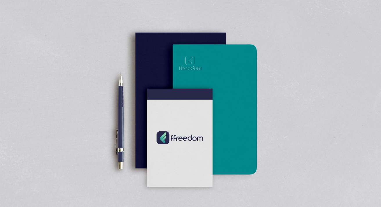


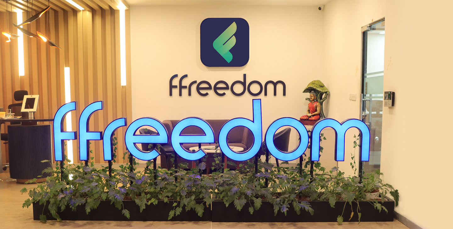
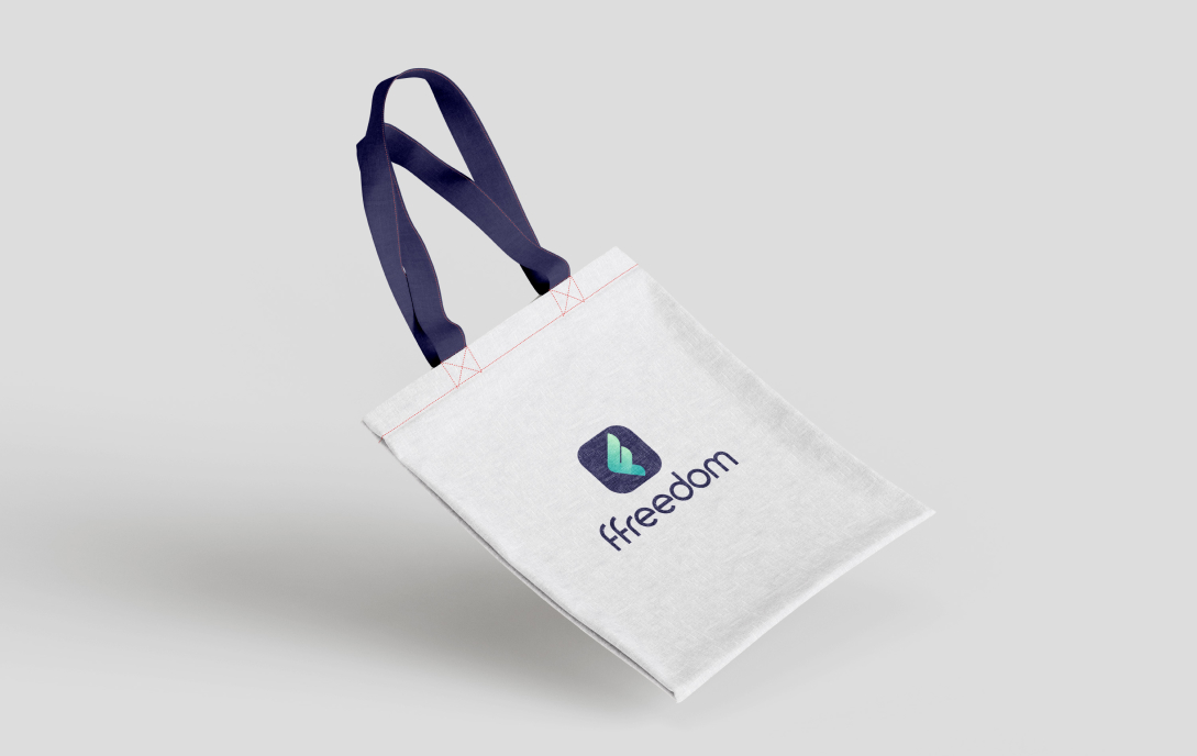
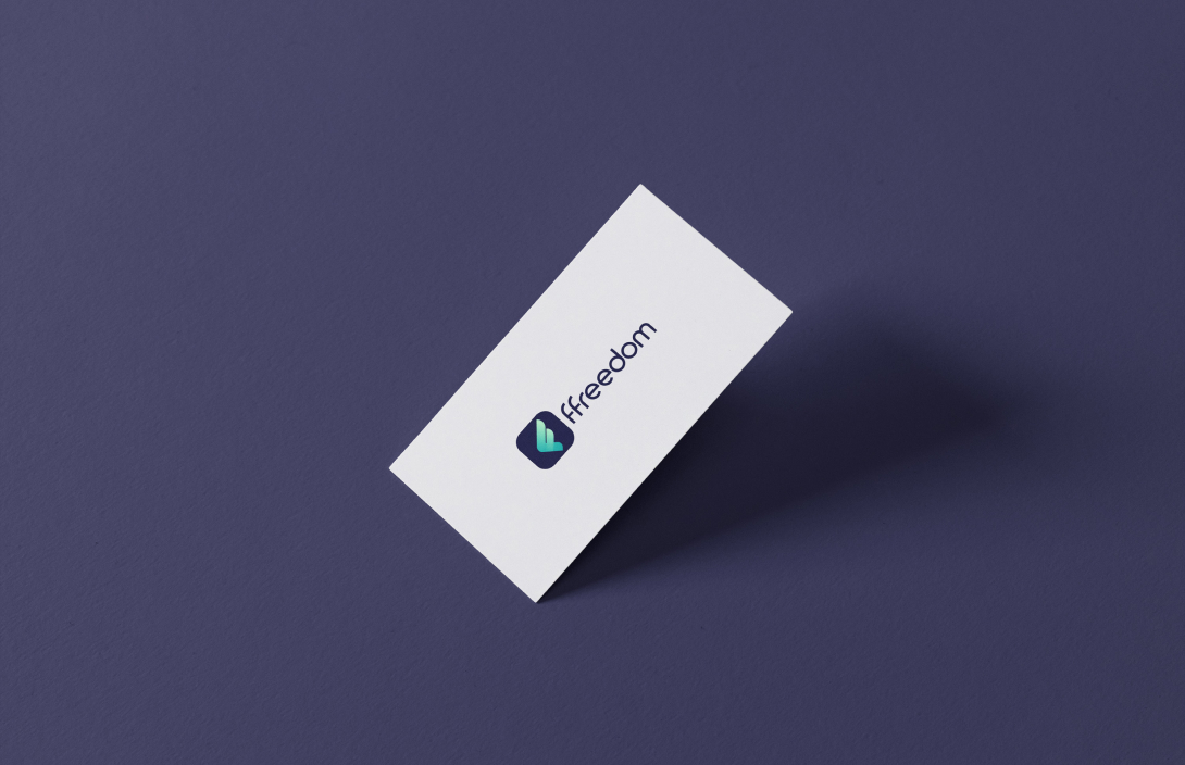
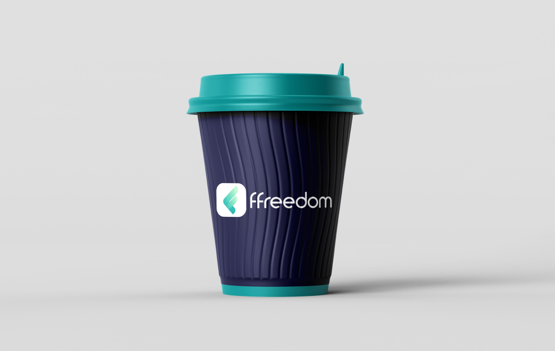
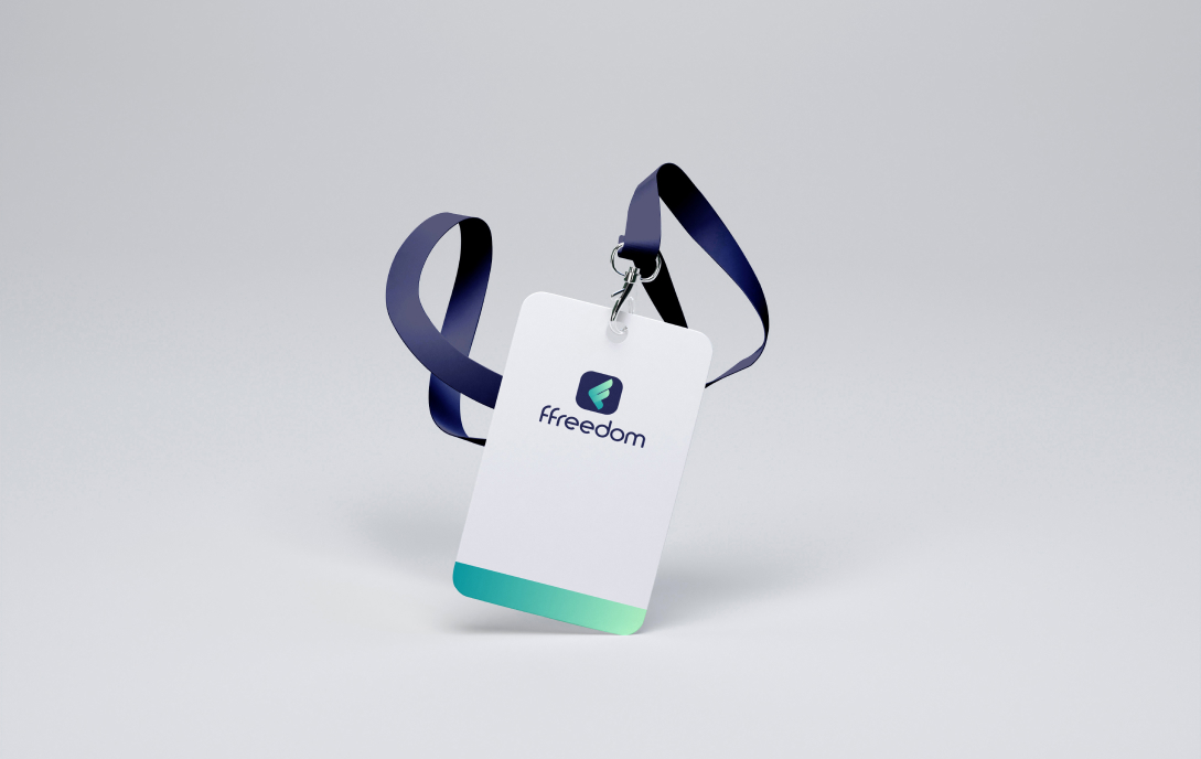
The result
After an intensive process, we got our happy ending. Our newly designed logo for ffreedom was admired by our clients at Indian Money and this new logo was memorable indeed!