Bridgestone

Designing a contemporary manual for technical services
Leveraging modern graphic design to create an all new technical service manual for a global brand.

Bridgestone, a Japanese manufacturer of tyres, has established a great presence in the Indian automotive industry with its innovative, state of the art products. The brand’s goal is to
provide cutting-edge Japanese technology to most customers around the globe, including India.
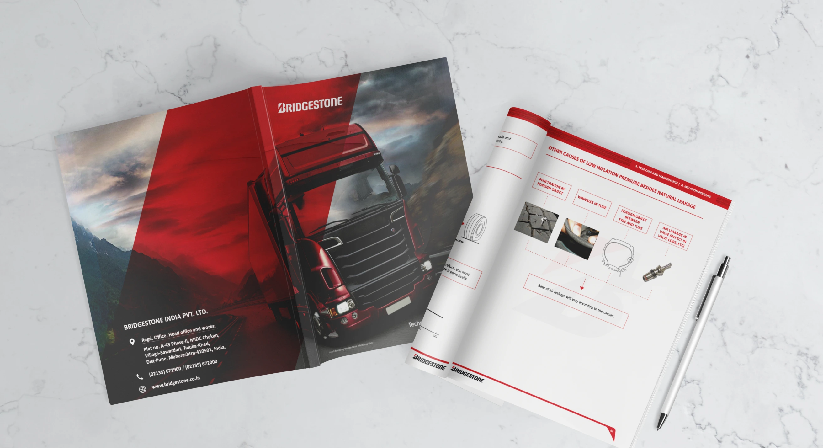
With design thinking and a clear approach, we aimed to create a technical service manual that captured this essence with illustrations that spoke the user’s language.
Challenge
To explain their services and offerings in the simplest way possible, Bridgestone wanted to put together a visually pleasing, clean manual that describes them best. The main challenge was to accommodate the manual with the right balance of content and visuals, without causing any information overload to the users.
Industry
AutomotiveServices
Graphic designCreative Quotient
Graphic designers
Our approach
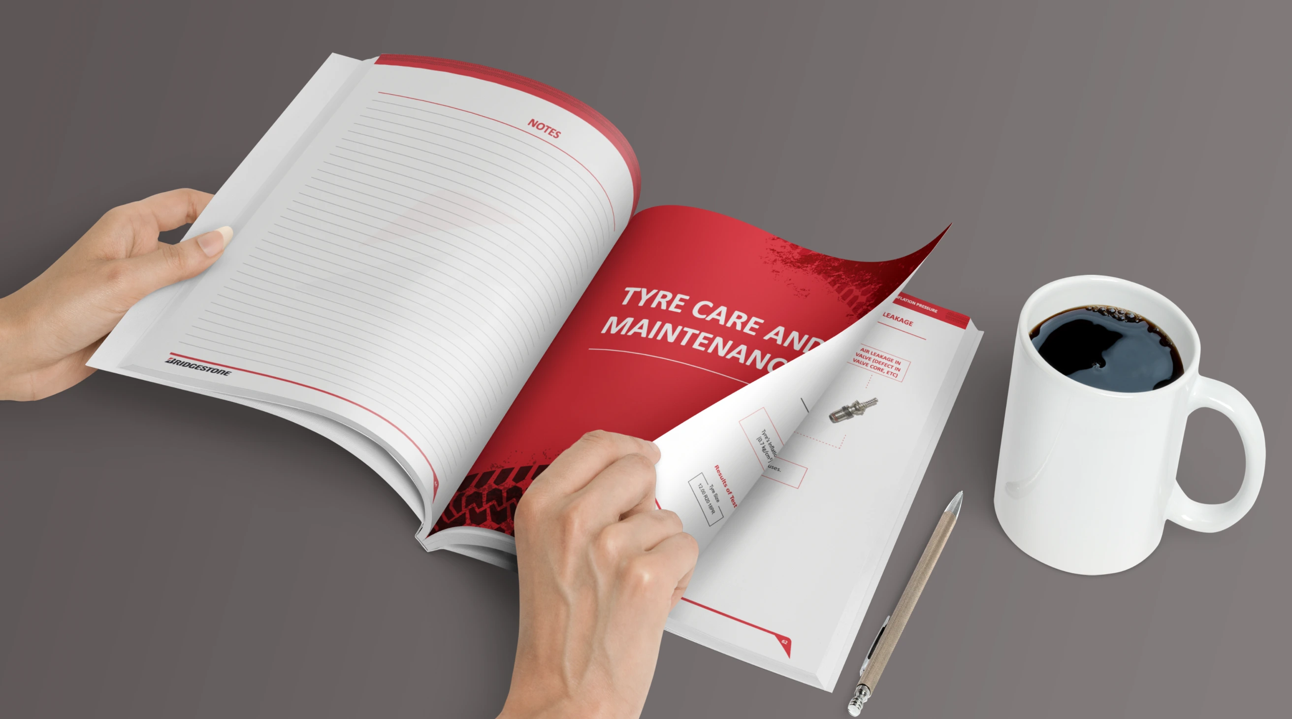
In order to streamline the technical services of the brand, our approach was to simplify their complexities and communicate them smoothly. We leveraged illustrations and visuals to capture the essence of the services and translate them seamlessly into clean, simple design. Without compromising the technical details, we covered all the nitty-gritties of the services by perfecting the balance between content and design.
Content heavy. Monotonous designs. Cognitive & information overload.
Polished illustrations. Revamped content. Cohesive design language. Entwined balance of content & design.


Simplifying technicalities with design
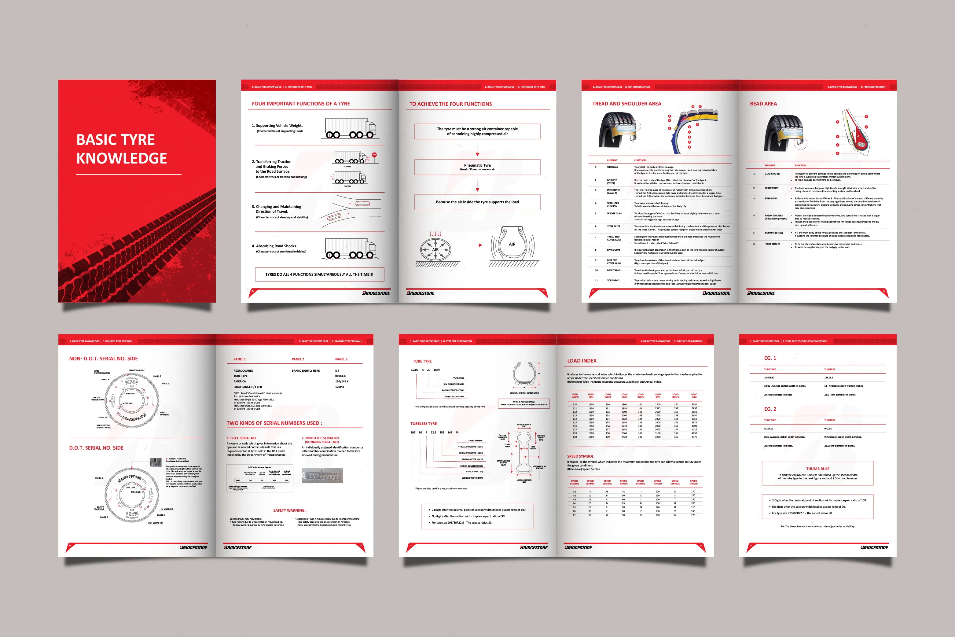
Each illustration is carefully designed to clearly depict the details of the service, be it the technology or the numbers. We ensured that every aspect of the manual was optimized with visually rich designs, for complete clarity, coherence, and a direct appeal to the users. Our goal, all throughout, was to uplift the functionalities of the brand’s services with aesthetic design.

Magnifying into the details
Redesigning Bridgestone’s service manual came with the heavy responsibility of retaining each and every technical detail mentioned in the manual. Since the manual dives deep into the technical functions and offerings of the products and services, it was essential to cover them all in a clear and precise manner. Every layout, imagery, illustration, and piece of content, thus, was aimed to do justice to these specific components.

The result
Lemon Yellow’s collaboration with Bridgestone resulted in a brand new user manual that was suited for a global company which speaks the language of its employees. The seamless adaptation of this manual was a delightful closing to this partnership! 🎉


