The Importance of UI Design in Social Media
Prerna Sajnani • Mar 1, 2023
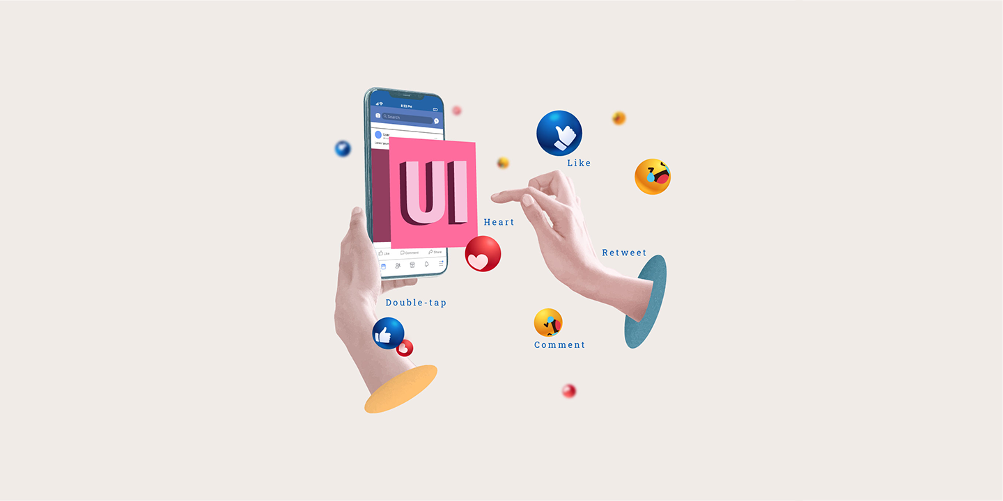
Double-tap, Like, Heart, Celebrate, Comment, Retweet, Delete.
Do these words automatically bring up a picture of what those icons look like in your mind?
But have you ever stopped and wondered why these social media applications have specific design elements that denote specific reactions and make your favourite apps look and feel the way they are?
What exactly do these design elements mean?
Who gets to decide what the application would look like?
Why did you never think of this before reading this blog?
This blog holds the answer to all of these questions.
The elements I mentioned, present in your favourite social media applications, are a small part of a bigger picture called UI design.
User Interface (UI) design is the layout of the application. This means that every single button you see to every single text you read on the application is the result of UI design. Ensuring that the application looks the way it was intended to requires blood, sweat, tears and a team of brilliant UI designers. For real.
The UI designers are entrusted with deciding the look and aesthetic of an application. This includes everything - from colour schemes to button shapes and sizes to font and text spacing. UI designers are responsible for making the application come alive from just a mere idea on paper, and that too in a way that is visually attractive.
Each application has its unique set of design elements and an aesthetic that helps us identify and differentiate that application from the thousands, if not millions, that are available out there. Owing to the time spent on these applications, these design elements and aesthetics get subconsciously fed to the minds of users. It is fed in such a way that a single word is enough to make you recollect what that element or application looks like. Just like it happened when you read the first line of this blog.
A common theme observed across all applications are the navigation design elements being placed at the bottom for easy accessibility of the user. Placing the frequently-used actions at the bottom makes it easier for the user to navigate with one-thumb interactions, considering these are mobile applications.
Let's break down the aesthetic and design elements of some of your favourite social media applications and understand how UI design comes into place in them.
Instagram:
An application that has attracted all age groups together. When it comes to the overall theme and aesthetic of Instagram, it's a minimal, well-designed platform that is easy to navigate. If one counts the hours spent aimlessly scrolling through Instagram's explore page, they are bound to get lost in its vicious cycle.
When it comes to the design elements, you will be able to experience it first hand when you see how just the words “double-tap”, “comment” and “save” give you an exact image of those icons of Instagram specifically. Each design element is aligned with the minimal theme of the app. From the house icon for the home page to the magnifying glass icon for the explore page, all the icons are black in colour with a sleek design style. As soon as you click on any of those icons, they turn bold and filled in with black to indicate your position on the application.
Every single detail comes to play during design, even the specific shade of red that appears when you like someone's post.
Looking at Instagram's design and aesthetic, it is easy to tell that it is designed in a way that makes a user feel welcome to share in a visually appealing manner.
Facebook:
The classic Facebook white and blue theme paired with the iconic “Like” design element are the two factors that differentiate Facebook from the rest. Facebook's theme and aesthetic is still the same as it was when it first came around, a platform where you come and connect with your friends.
The design elements have been changed throughout the years. At first, they were simple buttons for liking, commenting or sharing but today the same elements are animated to make them visually engaging. The navigation bar at the bottom consists of the frequently used elements and the lesser-used ones at the top.
Twitter:
A platform that has stuck to its roots when it comes to both the design elements as well as their theme. The overall aesthetic of the app is simple and prompting, designed to make the user feel welcome and spend hours scrolling through tweets and sharing their opinion.
Twitter's design elements have not changed drastically but they have been modified to look sleeker and visually attractive to the users. The “Favourite tweet” button being Twitter's most used design element, they make it stand out by adding a confetti animation that turns the heart button red makes people want to spend more time on Twitter favoriting tweets. Placing the compose tweet button at the bottom has also made it easier for one-hand interactions.
LinkedIn:
The theme, the design elements, the brand colours and the tone is what makes LinkedIn the professional platform that it was designed to be. The details of the design elements are
classic and formal.
The overall aesthetic of LinkedIn gives off a professional vibe, with the carefully crafted selections of reactions. You don't get a laughing reaction on posts, because meme marketing is not really a purpose that LinkedIn promotes naturally. Despite its formal essence, users don't feel out of their bounds because of how simple and user-friendly it is designed. From a fresher out of college to an old business person looking for connections, everyone is welcome on the platform.
To conclude, it is safe to say that something which may seem like a small button or signature colour of the application comes from a lot of thinking & brainstorming from the designers. So next time you double tap a post on Instagram or retweet a tweet on Twitter, remember a UI/UX designer has made it specifically thinking of you in mind.
For real.
Sharing is caring