Physical to Digital Metaphors: UI Design Inspired by Reality
Lemon Yellow • Mar 1, 2023
Let's have a quick test: I'll say some words, you just read them, and keep them in mind. Okay? Here we go:
- Delete
- Send
- Favorite
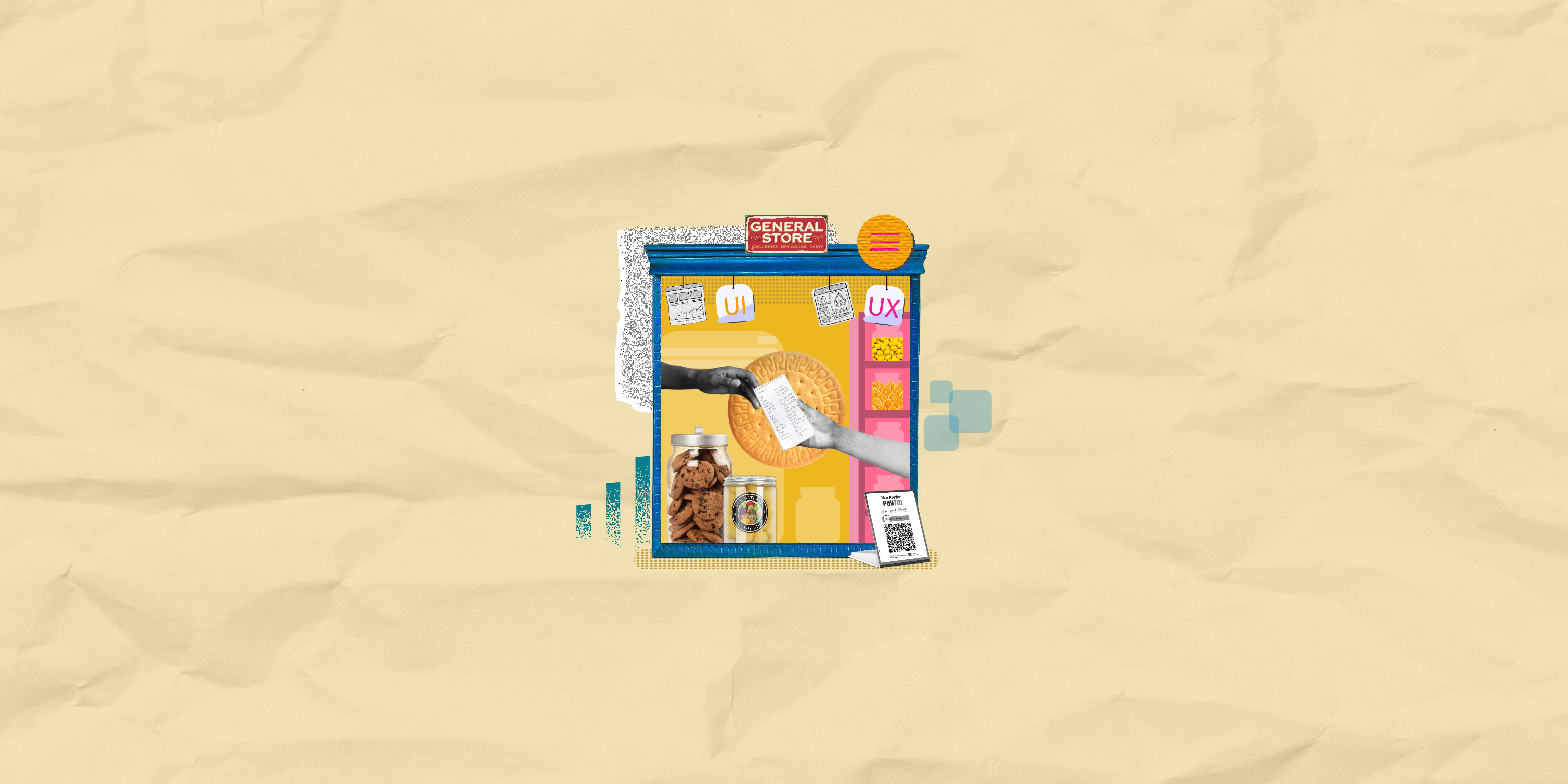
Now, when you think of these words, there are certain visuals your mind conjures up. Like when you read delete, a trash bin comes to mind; when you read favorite, a heart comes to mind. This happens because all of us are visual learners. We throw our trash into bins and we form a heart with our hands to the people who are our favorites. And therein lies the truth for UI/UX designers: you don't need to reinvent the wheel, you just need to observe and innovate out of what's already present. Use the user's learning. Look around you and then into the digital world that's ruling this generation. Some of the great classic UI elements have been inspired by real-life objects. The numerous menu buttons are almost all inspired by food items, search icon from the binocular, notification icon from the bell that announces someone's presence. And these are just some of the few examples out of many. In UI terms we call this skeuomorphism, though some would disagree by saying that it has been long out of style. In fact, according to the new digital trend, we now have something called neumorphism - the new skeuomorphism, that sheds the old detailed manipulation of real items into web design by creating a minimal imitation. The entire purpose of this real-life inspiration is to make your user feel comfortable with your product. In Martin Leblanc's words, “A user interface is like a joke. If you have to explain it, it's not that good.” The transition into digital has been so rapid that it is important to make the space familiar and accessible to the user. If they have to Google or go to ‘help center' every time they want to understand a design function, we fail. The idea is to make intuitive designs that the user can connect to, rather than smart designs that make them think. These metaphors from physical to digital can be applied in all types of UI - be it graphical, voice-controlled, or the latest gesture-controlled/touchless UI. Apple's smartwatch is the perfect example of the transition and merging of digital and real. A normal watch made smart through UI, with that touch of reality with Digital Crown. I mean, how would you switch from functions to watch? We know that a side dial is used to set a watch back on track, so it's quick for users to figure out that's what the dial would do on a smartwatch as well. It's not even a conscious decision, it's just something the user knows. As the world of UI evolves to include features that stimulate more than just the user's visual senses (think of haptic feedback, AR, VR), the experience is going to drive the design. So open your eyes, look out into the real world, because inspiration is just lying there.
Sharing is caring